Table of contents
Introduction
The CSS position property determines how an element is positioned in a document. The top, right, left and bottom
properties determine the placement of the element within the containing block or relative to their positioned ancestor.
Understanding the position property
gives you
good control over the layout of elements on the page, allowing you to move elements around in ways that are not
possible with normal document flow. In this tutorial, you are going to learn how to use the position property, the five
values of the position property
which are static, relative, absolute, fixed and sticky.
Prerequisites
This tutorial is for developers of all levels looking to understand the position property. The prerequisites for this
tutorial is the basic understanding of HTML and CSS
and having a code editor installed
Static
This is the default position of HTML elements, meaning no special positioning is applied. The static value positions
elements according to the normal flow of the document.
The top, bottom, left and right properties do not affect any element that has its position set to static
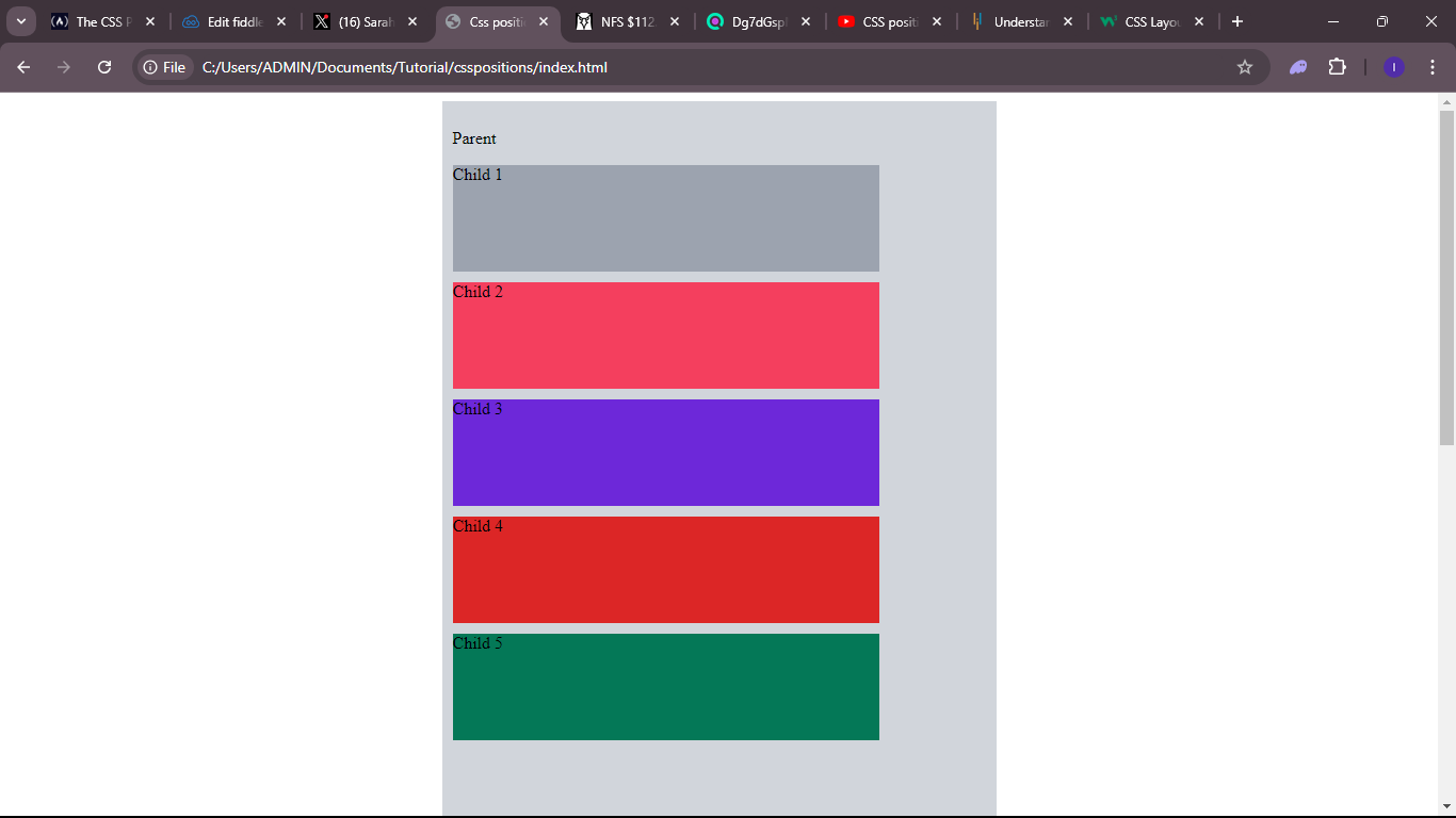
To see the CSS static position in play, we will create a basic HTML and CSS layout. We are going to use this
layout throughout this tutorial
<!DOCTYPE html>
<html lang="en">
<head>
   <meta charset="UTF-8">
   <link rel="stylesheet" href="style.css">
   <title>Css positions tutorial</title>
</head>
<body>
<main>
   <div class="parent">
       <p>Parent</p>
       <div class="child box-1">Child 1</div>
       <div class="child box-2">Child 2</div>
       <div class="child box-3">Child 3</div>
       <div class="child box-4">Child 4</div>
       <div class="child box-5">Child 5</div>
   </div>
</main>
</body>
</html>
We have a parent container that contains four divs as children. The child divs have a general class name of child and a specific class of box to style each of the children independently
.parent {
   width: 500px;
   background-color: #d1d5db;
   margin: auto;
   padding: 10px;
   height: 200vh;
}


.child {
   height: 100px;
   width: 400px;
   margin-top: 10px;
}


.box-1 {
   background-color: #9ca3af;
   position: static;
}


.box-2 {
   background-color: #f43f5e;
}


.box-3 {
   background-color: #6d28d9;
}


.box-4 {
   background-color: #dc2626;
}


.box-5 {
   background-color: #047857;
}
The .box-1 is set to position static. Adding the top, bottom, left and right properties have no effect on
this element as stated initially

Relative
The relative value positions the element relative to its normal position within the document flow. When the position
of an element is set to relative the element remains where it is according to the normal flow of the document, setting
the
top, bottom, left and right properties will adjust the element away from its normal position. Other elements
will not be rearranged to fit into any gap left by the element.
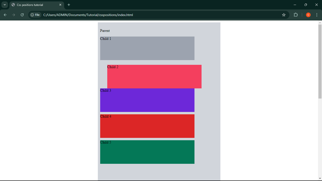
Let's set the .box-2 position to relative
.box-2 {
   background-color: #f43f5e;
   top: 10px;
   left: 30px;
}

Observe how the top and left properties moved the element relative to its normal position and how other elements
did not readjust to make up for the offset
Absolute
The absolute position takes the element out of the normal document flow and positions the element relative
to its positioned ancestor. The positioned ancestor needs to have a value position(relative, absolute or fixed)
other than static. If there is no positioned ancestor, it will be positioned relative to the <html> element.
In this case, other elements would rearrange to fill up the gap left by the absolute positioned element.
The top, bottom, left and right properties are used to determine the position of the element relative to its
positioned ancestor or <html> if no ancestor is positioned.
Let's set .box-3 position to absolute and the .parent to relative
.box-3 {
   background-color: #6d28d9;
   position: absolute;
   top: 10px;
   left: 30px;
}


.parent {
   position: relative;
}
 Notice how the element is removed from the normal flow of the document and positioned relative to the parent element 10px from the top and 30px from the left,
and also how other elements readjusted to fill up the space left by the absolutely positioned element. Absolute positioned elements can overlap other elements.
Fixed
The fixed position is similar to the absolute position in the way that it is pulled out of the document flow.
In the case of fixed position, it is always positioned relative to the viewport and does not scroll with the page.
The top, bottom, left and right properties are used to determine the position of the element relative to the viewport
.box-4 {
   background-color: #dc2626;
   position: fixed;
   left: 0;
   bottom: 0;
}
 Pay attention how the element was taken out of the normal flow of the document and does not scroll with the page.
Sticky
The sticky position behaves like relative and fixed position put together. The element is positioned according to the normal document flow and then
'sticks' to the viewport relative to the nearest scrolling ancestor. The position where the element 'sticks' to on the viewport is determined by the top, bottom, left and right properties.
.box-3 {
    background-color: #047857;
    position: sticky;
    top: 30px;
}
 Observe how the element remains in its normal position until it meets the offset specified by the
 top property then it 'sticks' to the viewport acting like an element with a fixed position
Conclusion
In this tutorial you learnt how to use css position property and the five possible positions which an element can have which are static, relative, absolute, fixed and sticky.
You also learnt about how the top, bottom, left and right properties are used to position elements relative to its containing ancestor.
HAPPY CODING!
